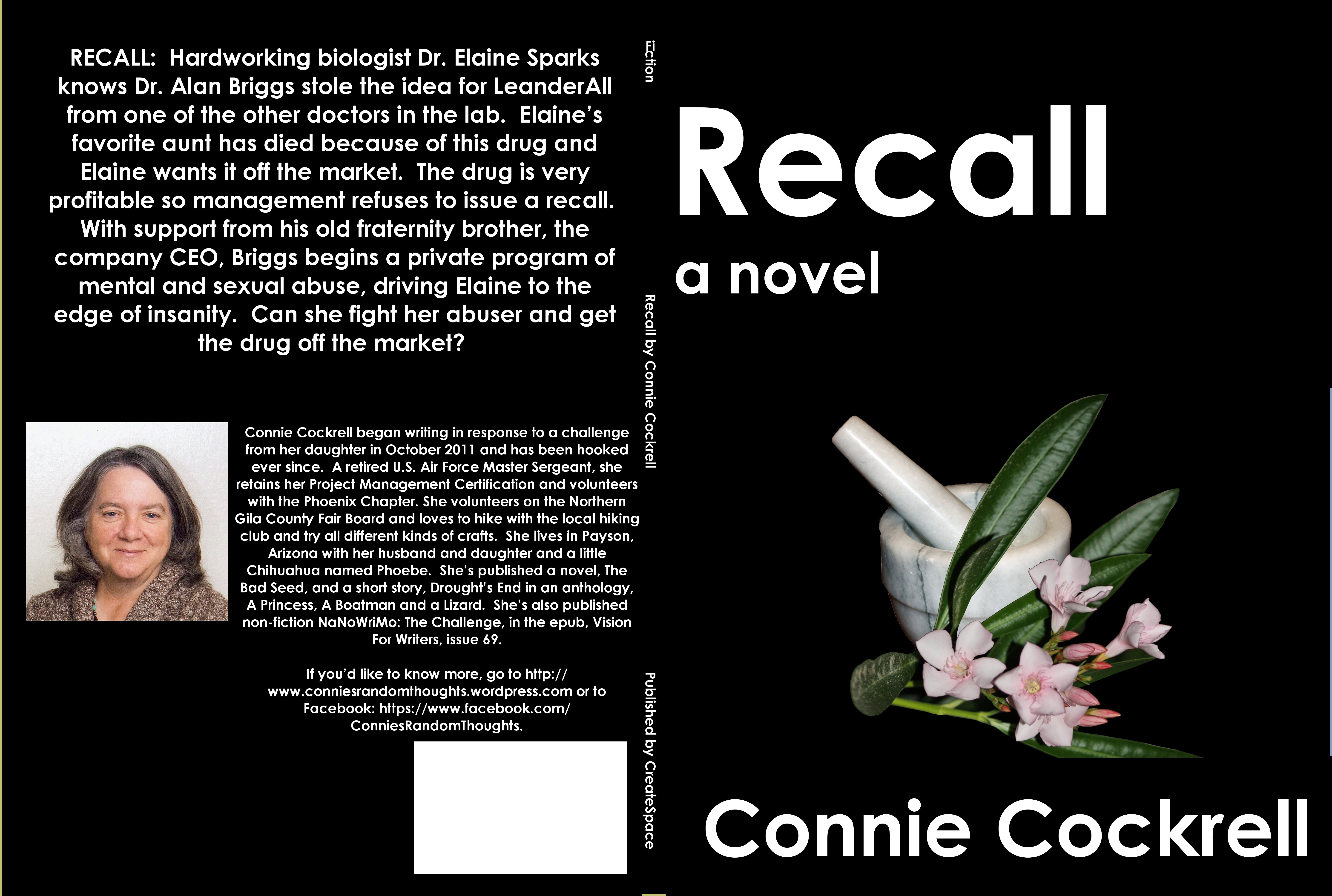
I’m closing in on my book cover design for Recall. I may actually get this done by the end of the month as I had planned. Which one do you like better? The bottom one has a bit of very dark pink around the title. If you like the outlined one, should the outline be deeper, more visible?

ConniesRandomThoughts
Thoughts and Activities About My Writing

Connie, on Pinterest the pink outline bleed into the white, but it’s probably my eyes. Or it could be that the line is so small, the pink flows into the while. Anyway, because of your subject matter and your use of pretty pink flowers next to the mortar and pestle it reads differently from your blurb. I’m getting mixed messages. IMHO. Still, you’re doing an outstanding job pulling all this together. You go, girl.
I personally prefer the top one, without the outline. In the bottom one, the title becomes an oddity in the design and becomes distracting from the overall look. It’s the only part of the book which has it, which gives a weird feeling that it’s the only part that matters (it’s not!).
Also, the word ‘fiction’ on the spine breaks off at the letter ‘i’ and heads south. I’m not sure if it’s intentional, but its something you’ll want to iron out if it’s actually a bug! 🙂
Thanks for the feedback, and the heads up on the spine error. I’ll check it out.